Macy’s - Virtual Agent
Opportunity: Research, UX/UI Design
Challenge: Improve existing Virtual Agent
Duration: Sept 2019 - Mar 2020
Overview
Problem Statement
As Macy’s Virtual Agent (VA), we want to help our customers to answer their questions correctly and as quickly as possible.
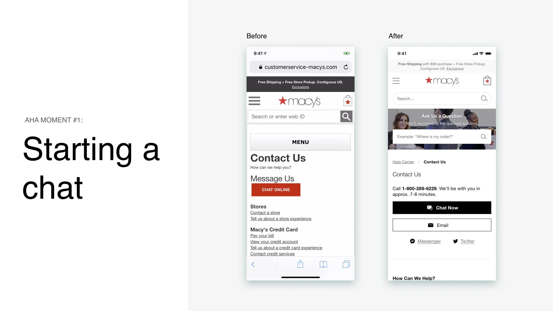
LT:DR
We want to personalized help for customers as much as possible. We connected our chatbot with login API which allows us to serve our customers as fast as possible. In addition, we improved the look and feel.
Before V.S. After
Define
Looking into Analytic
We want to solve the problem that is highly impacted to our customers. Based on our analytic data, the top 3 intends are Where is my order? Ask about my Return, and Ask about Promos. For this project, we want to prioritize to solve “ Where is my order” intent.

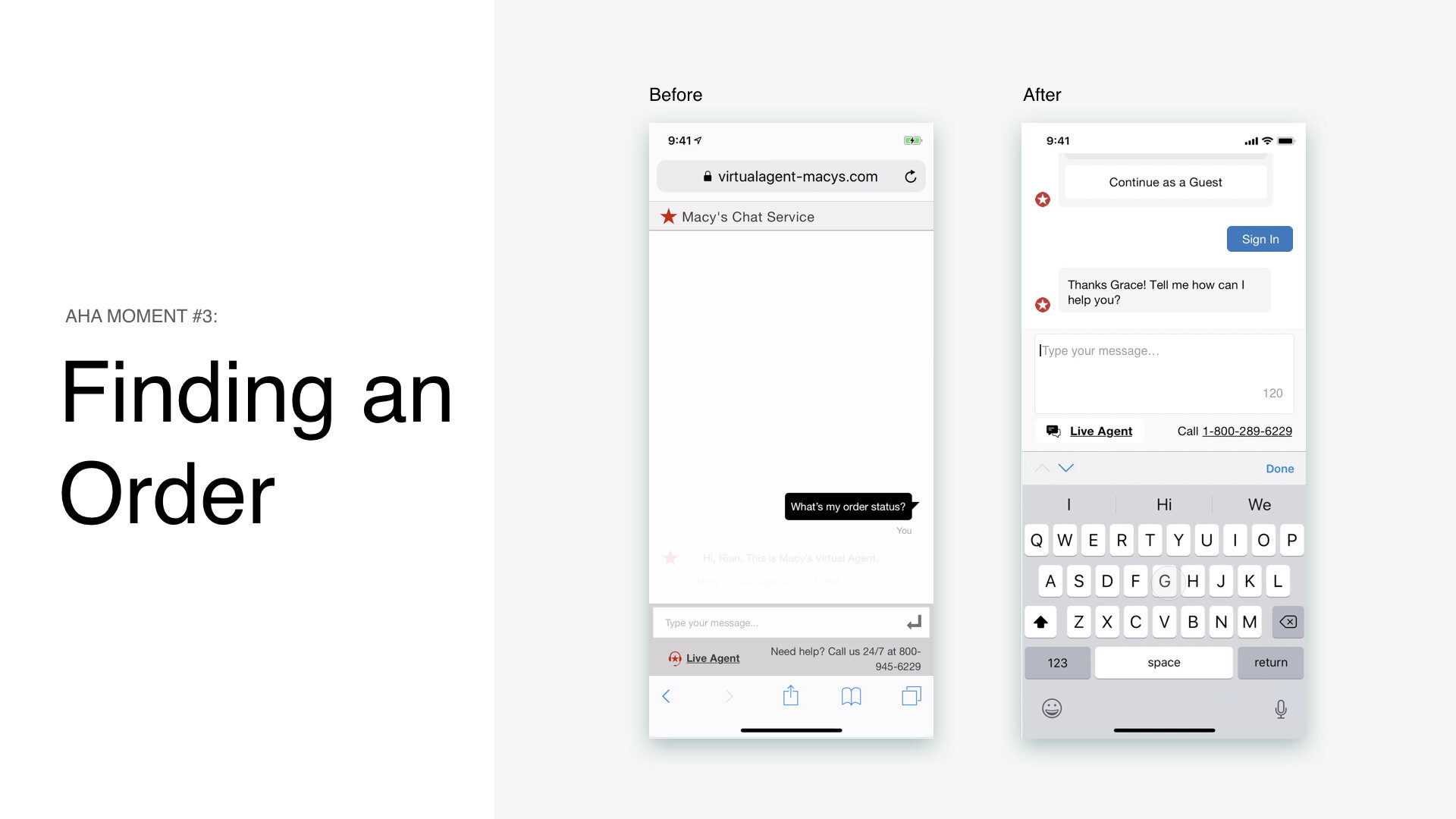
Problems with looking up orders
When customers look up their orders at VA, only 63% of our customers successfully look up their orders, and 11% of our customers enter the wrong order number and or email.

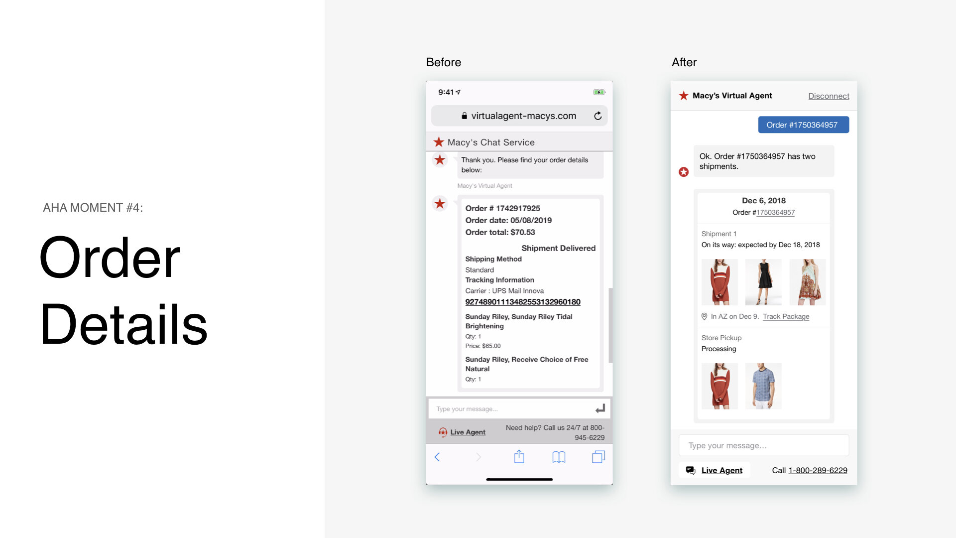
Current Screen of looking up orders
The below screens are looking up order. Here are this stages of looking up. Even with the happy path, it takes 20 steps for our customers to successfully look up their order!

Press Chat button / widget
Load entry form
Enter first name
Enter email
Enter question
Press “Enter Chat”
Load chat interface
Read VA introduction
Read VA’s response to question
Comprehend VA’s response (where to find number)
Remember how to find number (high cognitive load)
Scroll down to see order number form
Leave chat window
Find order number in email
Copy or remember order number
Go back to chat
Enter order number
Enter email or phone number
Press submit
Load VA’s response
Scroll down to see VA’s response
Read order information
Figuring out why?
As looking at it. We notice it is high interaction cost and it has unclear layout & Visual hierachy.

Design Goals
For this iteration, we decided these following are our design goals as our guiding north star
Make order easier to find and read
Reduce steps to enter chat, and ask questions
Provide more personalized help
Don’t make customers navigate in/out
Research
Competitive Research- Features

Competitive Research - UI
We looked at direct competitors as Amazon, but we also looked at best in class for the virtual agent. What I saw across universally is the counted edges on the chat to give a friendliness feeling. They have large images to display the product.

Final Prototype Comparison

Future Improvement
Voice input
Less steps to ask the questions
Message and question recommendation
Secure sign-in without leaving the chat